
Dyslexia is the most common learning disability. It runs around various misconceptions. The first misconception is that people with dyslexia are stupid or below average intelligence. That is not true, as they are intelligent and creative people. Another misconception is that people with dyslexia can only read or write words backward. It can sometimes happen, but only in a small percentage of dyslexic people.
The science behind dyslexia and reading difficulties
Dyslexia is a genetic disorder, but in some cases, brain trauma or ear infections can lead to this learning difficulty. Dyslexia affects their phonological processing. Phonological processing allows us to bridge the gap between reading and writing. There comes the importance of specialized fonts for dyslexic people and educational resources featuring these fonts (Open Dyslexic, ADYS, Comic Sans, etc.) These printable worksheets and activities will help teachers prepare for classes faster and save precious free time!
The need for specialized fonts
Most people with dyslexia have more trouble identifying words and grasping their phonetics and pronunciations. They might have trouble spelling, reading aloud, or comprehending. All of these symptoms can vary depending on age. By adulthood, most people with dyslexia understand words pretty well, but they might still have trouble spelling or reading as quickly as people of their own age.
In 2008 Christian Boar, a Dutch artist, developed a specialized font called Dyslexie to facilitate reading in children and adults with dyslexia. The font has received a lot of media attention worldwide.
Later, other fonts appeared. For example, Open Dyslexic is one of my favorite ones – I use this font when I need to proofread a large text fast. I can see how readability and speed increases if you shift to Open Dyslexic.
ADYS is one more great example of dyslexia font. It is for people with mild moderate dyslexia back in 2016. You will be surprised, but ADYS has also got a Cyrillic version. I love using it for the headers while creating my worksheets. I think it looks beautiful too. Click here or here to see the ADYS font featured in my alphabet worksheets.
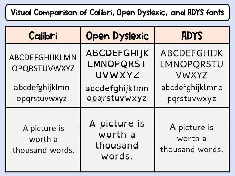
Look carefully at this table. It shows how non-dyslexic and dyslexic fonts look. I created it to show the visual difference between dyslexia fonts and Calibri, a popular simple font from Office. For non-dyslexic people all these fonts are equally readable. I would rather say that Open dyslexic looks ‘strange and unusual’ to them. You can see the difference if you move a bit further from the screen and try to read the text. I bet Open Dyslexic will be the easiest. Also, take some time to look carefully how the letters differ from Calibri. There is also a difference in letter size and spacing that are super important for people with dyslexia.
Common problems and solutions
- For letters
If you take a regular cup of coffee, switch, rotate and mirror it, it will always be a cup of coffee. But look what happens when we do that with a letter. The meaning will change.
Letters [p q d b] are all based on circles. They all look alike, especially when you rotate, mirror, and switch them.
Letters [m n h u] are all based on arches – that is why it is problematic for people with dyslexia.
For the letters with confusion, there are some alterations. Their other side is made bolder. So they don’t flip them anymore because they know the heavy bold part will go down.
And for mirroring the letters, (d and d) slant their circle parts so that they don’t look alike at each other anymore.
And for letters that look alike, like this (ij), People with dyslexia may read as ii or jj. To overcome this slant the whole letter, then i and j have different slopes.
For letters like [ o s c e ] the openings are big. They are just better at recognizing each other. The differences in letters are stressed more to make them more unique.
- For sentences
The main problem faced by dyslexic people while reading is that they miss the capitals and the punctuation. In order to solve this problem, the capitals and punctuation are larger. It creates a kind of stop sign in their text to take a breath and read the next line.
- Crowding effect
When letters melt together, they find it more difficult to read sentences. As a solution, rearranged spacing between the words and between letters. These extra spaces help to distinguish each letter better.
The summary
Specialized fonts are not the ultimate solution for the reading difficulties faced by people with dyslexia. Of course, they give some relief to them. These days, more such fonts are available, and even a classic Comic Sans is helpful for dyslexic people. These fonts help students read faster, improve reading comprehension, ultimately do better at schools and colleges, and have better career opportunities.
