Dyslexia is a neurological disorder that affects reading skills. Unfortunately, people with dyslexia have difficulty reading words accurately and fluently. This disorder can of course impact writing, spelling, reading comprehension, and other activities that involve reading. Therefore, there are dyslexia fonts that can effectively help struggling students and emerging readers improve their academic performance!
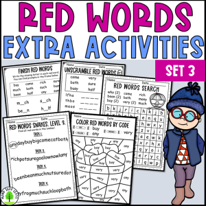
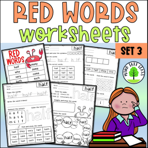
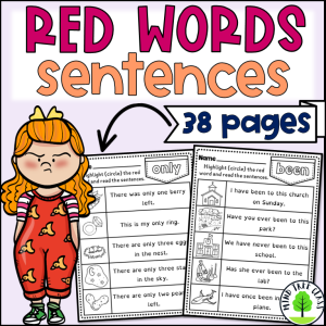
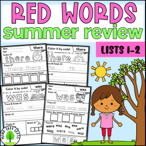
However, there are a lot of educational resources created with specialized fonts to help students with dyslexia read faster and easier. For example, these printable alphabet flashcards, Present Simple worksheets, and red word bookmarks feature Open Dyslexic font.
Do specialized dyslexia fonts help to read?
Unfortunately, there is no definitive answer to this question, as different people have different reading styles. Dyslexia-intervention typefaces are handy reading aids. To put it another way, some researchers and educators believe specialized fonts help dyslexic people read more easily by breaking up the text into smaller and more manageable chunks.
Moreover, these fonts may also help dyslexic people focus more on specific words or letters. Specialized fonts are certainly not a magical solution for reading disabilities, this is an effective helping tool.
Origin of specialized fonts
In 2008 Christian Boer, a Dutch artist and graphic designer developed a Special font named DYSLEXIE, to facilitate reading in children and adults with dyslexia. What’s more, Christian himself was challenged with dyslexia too. The font has received a lot of media attention worldwide. Without a doubt, it was the first attempt in the field of dyslexia-friendly fonts.
Different types of dyslexia fonts
Dyslexie
Firstly, it is the first specialized font designed for people with Dyslexia. It is easy to install on the computer. It comes in 4 files (regular, bold, italic, and bold italic). Just keep in mind that Dyslexie is a paid font. With this in mind, you have to buy a lifetime license for home, education, or business.
The main features of the font are:
- Heavier bottoms
- Different shapes
- Better spacing
- Longer sticks
- Capital letter and punctuation
- Inclined letters
- Bigger openings
- Various heights
Open Dyslexic
Unquestionably, it is a new open-sourced font created to increase readability for readers with dyslexia. The typeface includes regular, bold, italic, and bold italic styles. It has also two typefaces: OpenDyslexic, and OpenDyslexic-Alta. Letters have heavily weighted bottoms to indicate direction. This design makes it easy to distinguish which part of the letter is down. The letter shapes are unique to prevent confusion. OpenDyslexic has other features, like wide letter spacing and a unique italic style.
In addition, there is also a Google Chrome extension made by Abelardo González and Robert James Gabriel. Open Dyslexic is free for personal, educational, or commercial use.
ADYS
In brief, Bulgarian speech therapist and Ph.D. student Teodora Yaramova designed ADYS to help people with mild to moderate dyslexia. However, it does not create discomfort for people without dyslexia and makes it suitable for widespread use. ADYS was initially created for the Bulgarian language based on Cyrillic letters. Significantly, the font is free to use and easy to install.
The main characteristics of ADYS are:
- Non-modular construction. To put it another way, the use of different elements for the construction of common visual signs. They give individuality to the signs and make it easy to differentiate between signs and text.
- Open signs. In fact, open signs give the text a wide extent, and they increase readability. Wider gaps between the letters in the word and between the words surely help recognize the space within the sign.
- Clearer shapes and capital letters
Comic Sans
Comic Sans was basically designed by Vincent Connare and released by Microsoft back in 1994. Besides, it was inspired by graphic novels and developed for children. It is still quite popular among educators and widely used in schools and textbooks. The distinctive design of the letters makes them easier to read.
Bad fame of Comic Sans
Surprisingly, there is no font like Comic Sans which creates so many arguments and discussions even these days. Some people even consider it to be outdated, and at the same time educators defend it calling it “children-friendly and the best font for primary school education”. The controversy is because of the massive misuse of Comic Sans in official documents, warning signs, etc. It undeniably tends to look inappropriate or unprofessional on serious occasions. Moreover, there are tons of funny memes related to Comic Sans on the internet.
Not that bad font
Seriously speaking, a 2010 research by Cognition has shown that Comic Sans can improve classroom performance. Once I ran a “font experiment” with my teenage student who has dyslexia. I prepared 7-8 samples of the same text in different fonts. The girl looked attentively and slowly at them one by one. Obviously, she knew that it was an experiment. And guess what? She suddenly told me that the text with Comic Sans was the easiest to read! The girl didn’t know the name of the font nor its ‘bad fame’.
My opinion on Comic Sans
Without a doubt, I like Comic Sans because it is a time-proven font for primary students and students with dyslexia. A few months ago, I got a 5* review on TpT, and the buyer thanked me for using the Comic Sans font!
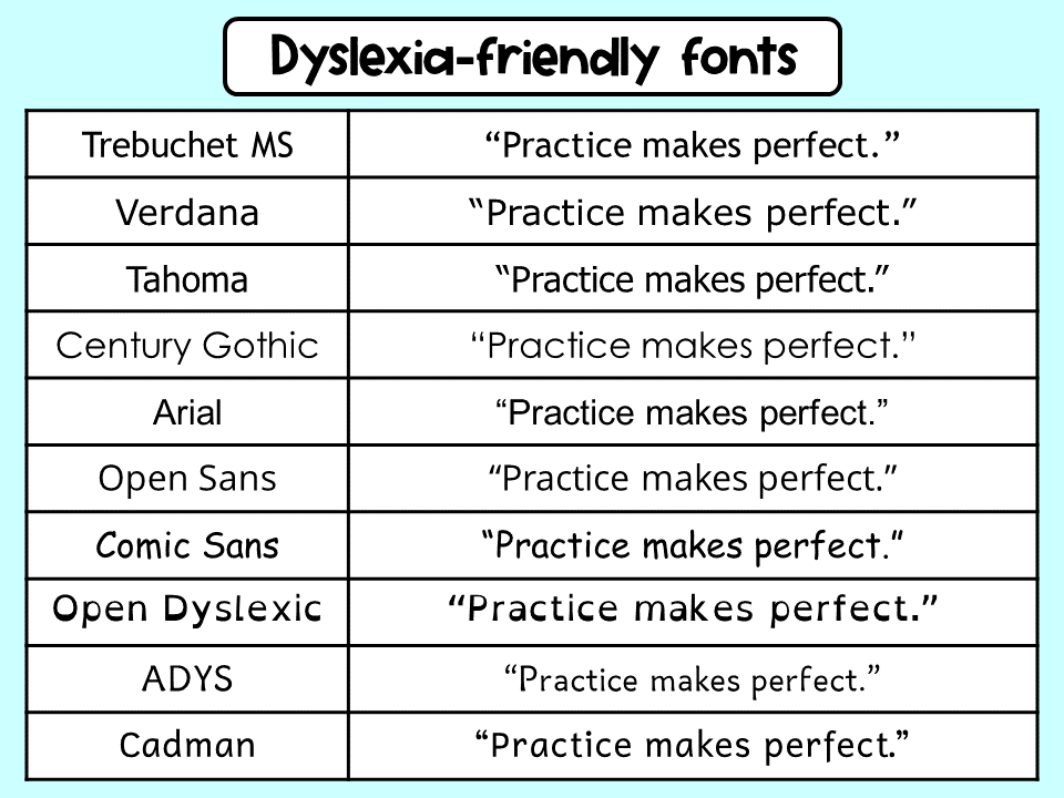
Other suitable fonts for people with dyslexia
For example, you can look at the table below. I have wrote the same sentence in different dyslexia fonts. Surely, you can see how different these fonts are but at the same time they are very readable for dyslexic people.
- Tahoma
- Century Gothic
- Trebuchet
- Open Sans
- Helvetica
- Sylexiad Serif
- Lexie Readable
- Cadman
- Circs Inkboard Font
- Laurelin
Gadies
Unfortunately, these unique fonts cannot solve all the problems faced by people with dyslexia in reading. No font is perfect. Dyslexic people do not have the same issues with letters. Some have an issue with mirror letters, some might not, and for some, the letter with arcs is a problem.
To sum up
Hence, one specialized font is not enough. Students with dyslexia chiefly need early intervention, specialized educational resources, multi-sensory teaching, sometimes individualized education programs (IEP), and a bit more time in the classroom, moral support, and patience to overcome reading difficulties.
You can read one more blog post about dyslexia fonts here.